Louder
Conceptual | UX/UI

The Problem
Long lines for service providers downgrade the concert experience.
The Solution
A unique hybrid between festival app, food ordering app & pickup lockers (like PickUP, BoxIT, Amazon etc...), combining new and old technologies to upgrade the concert experience.
My Role
-
Concept
-
UX
-
UI

Wireframing
After a small market research and interviewing
about 10 concert and festival lovers I created the
next wireframes, which describe the main flow of the app.
OnBoarding
Is the first encounter of the user with the app.
It contain a short explanation of what
this app is all about.


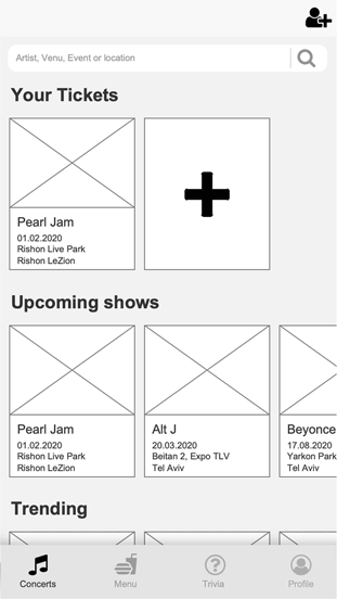
Main Window
The first and main screen of Louder,
where the user can view his saved concerts, get recommendations, preorder from the bar and more.
Main Process
Ideal user flow for the first app navigation.
Swipe between images to see more of the process.


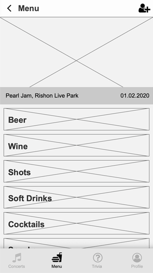

Menu
WF of the menu process.
Inspired by popular food ordering apps out there.
Swipe between images to see more of the process.
Design
Louder app design is inspired by the "night life scene".
Dark screens for dark venues makes the UI better to handle,
minimalistic colors approach, yet - young and intresting.

OnBoarding
Is the first encounter of the user with the app.
It contain a short explanation of what
this app is all about.


Main Process
Ideal user flow for a first time encounter
with the app.
Swipe images or use arrow, Press image for full screen.
Menu
Menu design - based on the WF, designed in the general spirit of the app.
Swipe images or use arrow, Press image for full screen.


Checkout
A critical part of any "e-commarce" platform,
designed to create an easy flow, to ensure purchase complete & creating a good, informative experience.
Trivia
The fun part of the app, enable the user to engage his knowledge, earn points and transform them into a discount at the bar.


